

UdacityThe Learner's AI Layer
My Role
Udacity teaches people technical skills they intend to get paid for. That single fact makes it a harder product than it looks: a learner does not arrive wanting a course, they arrive wanting a job, a promotion, or a gap closed before Monday. Everything between those two things — the questions you ask at the door, what you remember about the answers, and what you do with them three weeks later — is the product.
I joined a two-person design team inside a developer-first organisation, and I was not assigned a feature. I was assigned a spread: onboarding, the AI guide, the classroom, the coding workspace, the skills model, and the internal tools the content team uses to build any of it. That position is the reason this case study is one story instead of fifteen. Sitting across teams is how you find out that the onboarding asks a learner their goal and the classroom never uses it.
- Product Design, End to End: Flows, interaction, states and UI across learner-facing and staff-facing surfaces, from the first question a new user is asked to the versioning model in the authoring tool.
- AI Experience Design: Designed the assistant as a persistent layer with a persona, a memory the user can read, and defined moments where it is allowed to interrupt — rather than a chat window bolted to the corner of a page.
- Systems Thinking: Connected onboarding, skills, assessment and recommendations into one model of the learner, so each surface could act on what the others had already learned.
- Design System & Consistency: Pushed reusable patterns and a shared component language across teams that had historically solved each screen independently.
- Process: Argued design into the room earlier than the handoff — exploration and problem definition before requirements, in an organisation where the default was a PRD and a ticket.
All screens shown are my design work. Product data is placeholder or anonymised, and nothing confidential to Udacity, Accenture or their enterprise customers appears here.
The System, Not the Screens
The work reads as a scattering of features until you put it in order. Then it is one loop: find out who this person is, find out what they can already do, decide what to point them at, help them do it, and use what happened to update the first two answers. Every project I worked on lives at one of those five stages.
-
Stage one
Understand the learnerOnboarding built around intent, not enrolment. Goal, starting point, confidence, time available, target role — captured as an editable profile rather than a one-time survey.
-
Stage two
Read their skillsAssessment across two generations of system at once: the legacy CAT engine and the newer SAGE / Signature assessments, plus Workera, resolving into one skill signal the rest of the product can use.
-
Stage three
Decide what to point them atRecommendations and a personalised plan, driven by the profile and the skill signal together, so the next action is an argued choice rather than a catalogue.
-
Stage four
Help them do the workThe classroom and the coding workspace, with the assistant present in both — able to see the lesson, the code and the profile at the same time.
-
Stage five
Close the loopProgress, detected skill gaps, reassessment and the next action, feeding back into the profile that started the whole thing.
Underneath all five sits the part with no screenshot: the authoring tools the content team uses to produce what learners see, and the shared component language that keeps five squads from designing the same card five ways.
Understanding the Learner
The existing entry experience did what most learning platforms do: it let you in and showed you the catalogue. That is a reasonable design if your problem is enrolment. It is the wrong design if your problem is that a learner who picks badly on day one churns on day thirty.
I challenged that direction and designed onboarding as an interview about intent. Why are you here — job-ready, a specific skill, assigned learning, growth in your current role? Where are you starting from, and how sure are you about that? How much time can you realistically commit? What role are you aiming at? The output is not a filtered catalogue. It is a plan, with an argument attached: skip the basics because you told us you have them, at this pace because you told us you have four hours a week.
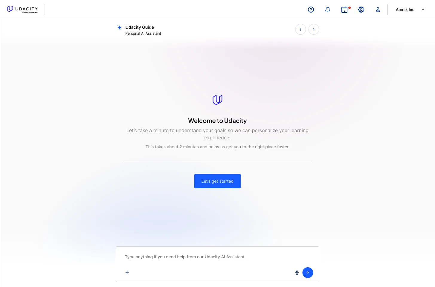
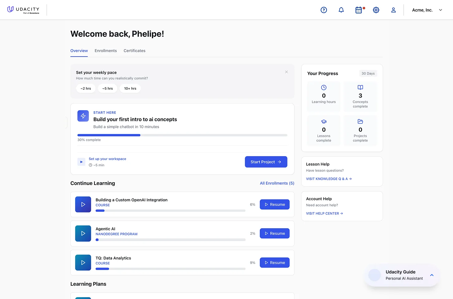
The full-page entry, and the dashboard the answers produce.
The detail I care most about is the placement. Onboarding is also conducted by the assistant, in the dock the assistant will occupy for the rest of the relationship, not only in a full-bleed wizard that appears once and is never seen again. A learner's first two minutes teach them where help lives. Spending those minutes in a modal teaches them the wrong location.
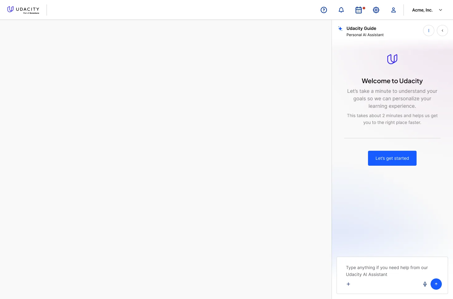
The same interview, run from the dock it will live in afterwards.
Everything asked is short enough to answer honestly. The screen promises two minutes and means it, because an onboarding that takes eight is answered carelessly, and a personalisation model built on careless answers is worse than no personalisation at all.
A Personality With a Job
The assistant needed a face, and the reason is not decoration. A bare chat field in a learning product invites the one behaviour the product cannot afford: asking it for the answer. A character can decline. Marvin's opening line does exactly that — I'll help you build what you need to do, but I won't give away the answers. I'll use this as an opportunity to teach you along the way. That sentence is a product rule, and it lands better from something with eyes than from a system message.
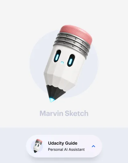
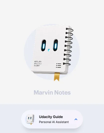
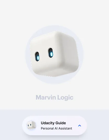
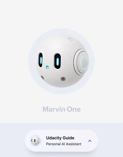
It is one assistant with several bodies, not four assistants. Sketch, Notes, Logic and One are the same guide showing up as the tool the moment calls for — a sketchpad, a notebook, a reasoning engine, a companion — so the learner can tell at a glance what kind of help is being offered without reading a label. The dock chip carries whichever face is active, which means the assistant's state is legible from the collapsed state, before anything is opened.
The character set, as presented to the team.
Memory the Learner Can Read
An assistant that personalises invisibly is a black box the user is asked to trust. I designed the opposite: the profile is a page, it is written in the assistant's voice, and the header says plainly what it is — these fields are injected into Marvin's system prompt on every chat turn, click any item to edit it.
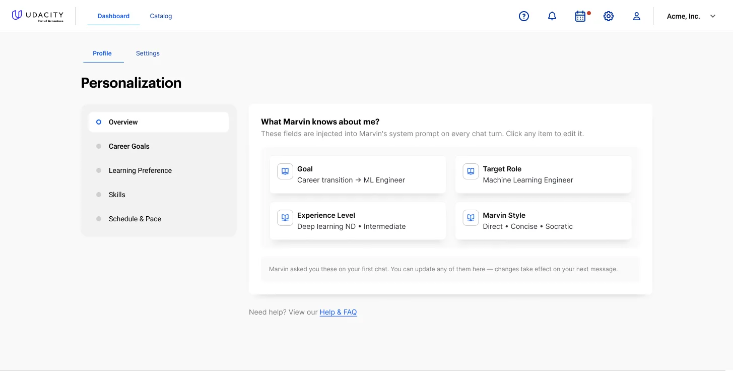
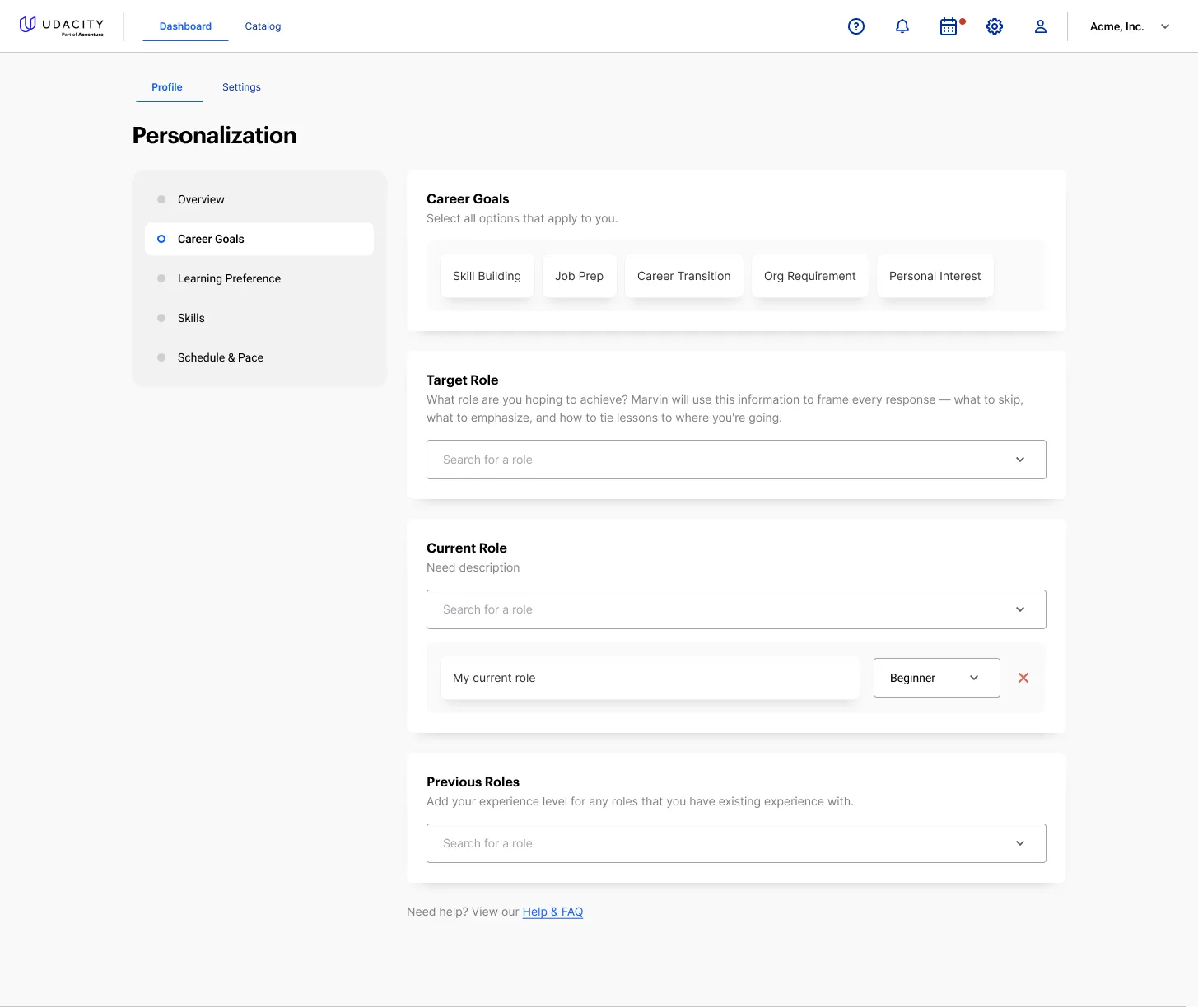
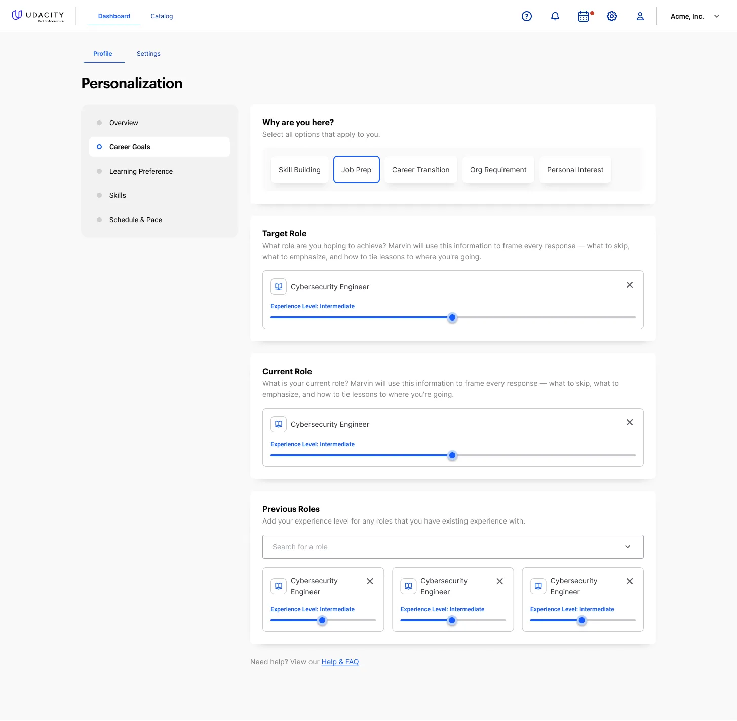
The memory summary, and the career fields behind it.
Four things it holds: the goal, the target role, the experience level, and the style the learner wants to be spoken to in. The last one is not a preference toy. Communication style, verbosity, coaching style and personality are separate axes, because "direct and concise" and "Socratic and encouraging" are genuinely different products for the same content, and a learner two weeks from an interview wants a different one than a learner starting from zero.
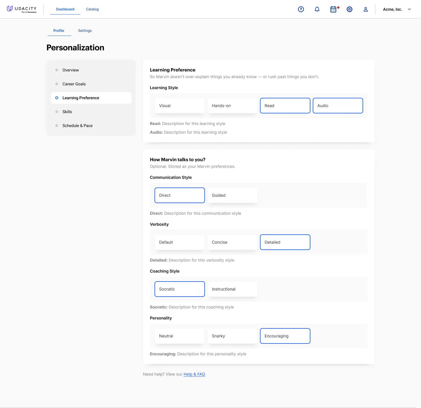
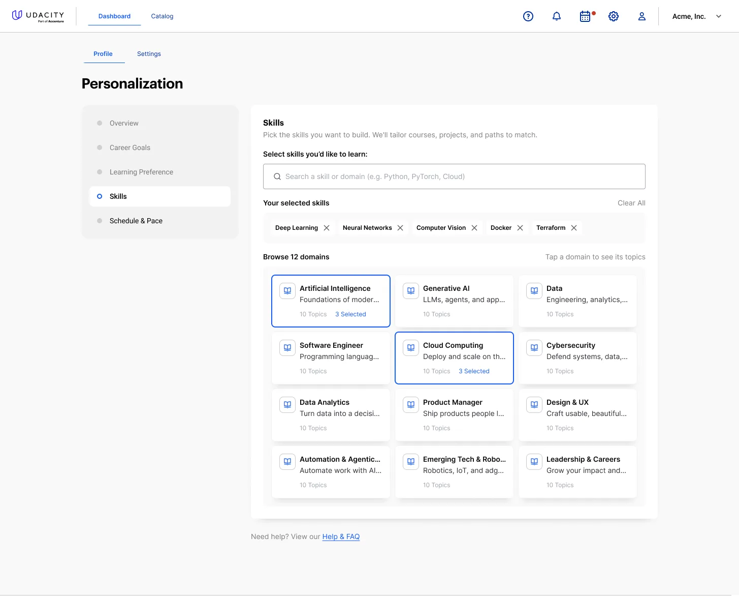
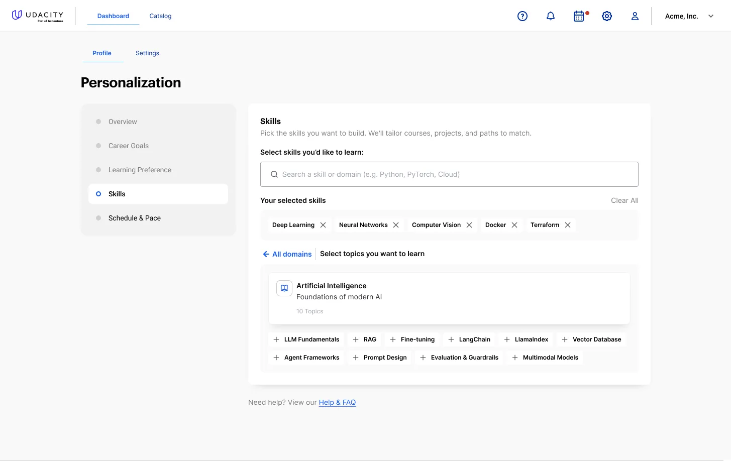
Tone controls, and the skills model the recommendations read from.
The skills half is the join between this profile and the rest of the platform. A learner picks domains and then topics inside them, and that selection is the same object the assessments write to and the recommendations read from. Onboarding is not a separate survey table — it is the first write to the record everything else uses.
The Decision
Personalisation is easy to add and hard to make anyone believe. The choice that shaped this whole layer was where to put the model of the learner.
The path I took
Make the memory a page the learner can read and rewriteEvery field the assistant is given is shown, in plain language, on a profile the learner owns — with the mechanism stated outright and every value editable. If the product has drawn a wrong conclusion about someone, they can see it and correct it in one click.
The option I killed
Personalise silently and let quality speakInfer the profile from behaviour, keep it internal, and let the learner experience only the results. It is less UI, less to maintain, no wrong-looking field to explain, and it is what most recommendation surfaces do.
What choosing it cost
A whole surface to design, maintain and keep truthful — and a standing obligation that the visible fields actually match what the model receives, which is a real engineering constraint rather than a design preference. It also exposes the system when it is wrong: a learner reading "experience level: beginner" after ten years in the field is a bad moment that silent personalisation never has to survive. I took it because in a product about competence, being told what a system thinks you are capable of is not a settings screen, it is the relationship. A learner who can correct the record will; a learner who cannot will just quietly stop believing the recommendations.
One Lesson, Several Ways Through It
The classroom is where the personalisation either pays off or is exposed as decoration. The same lesson is offered as Guided, Read, Hands-on, AI Summary and Full Transcript — not five pieces of content, one piece of content with five doors, so a learning-preference answer given at onboarding has something concrete to act on.
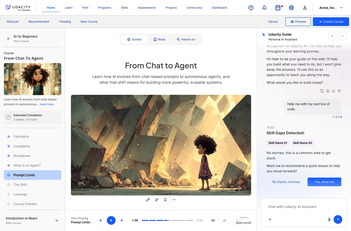
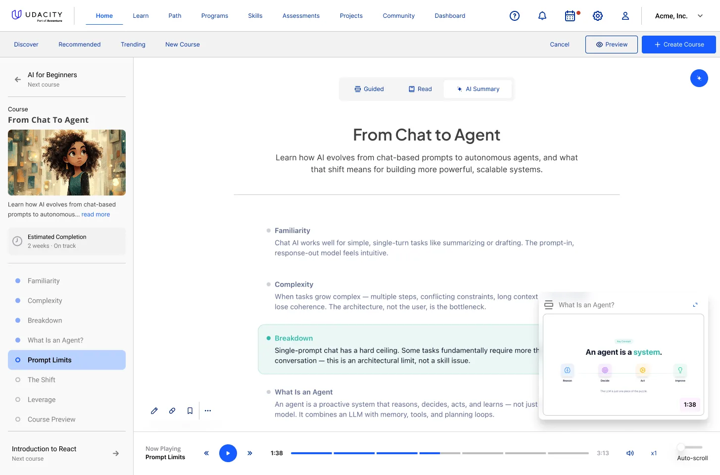
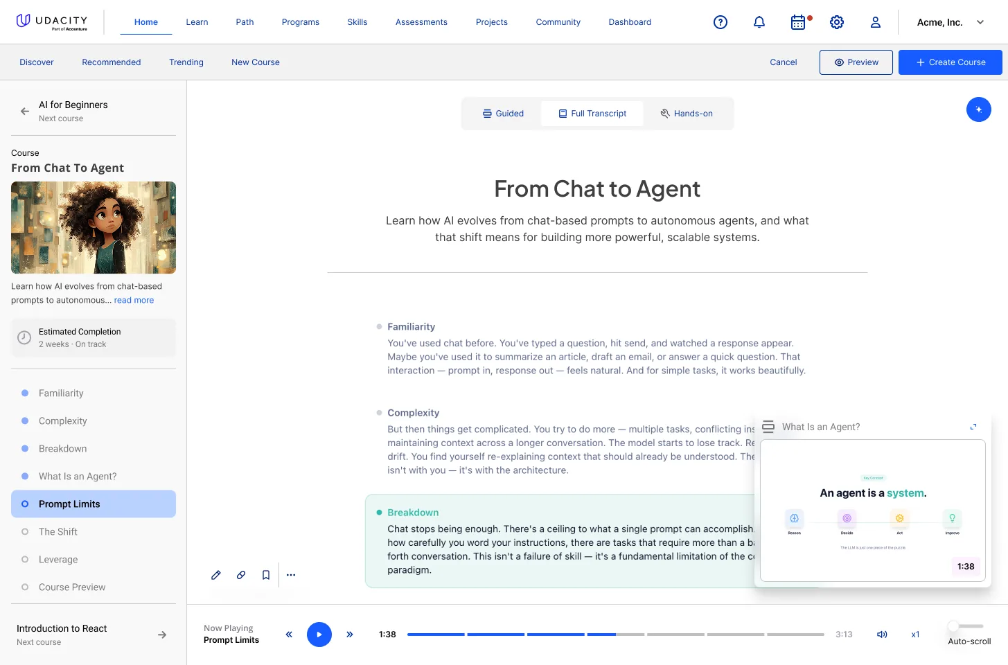
The same lesson, three ways in.
Two details do most of the work. Narration is time-synced to the text with auto-scroll, so a learner can listen and read the same sentence instead of choosing; and definitions surface as inline concept cards at the moment the term appears, which keeps a learner from leaving the lesson to look something up and not coming back.
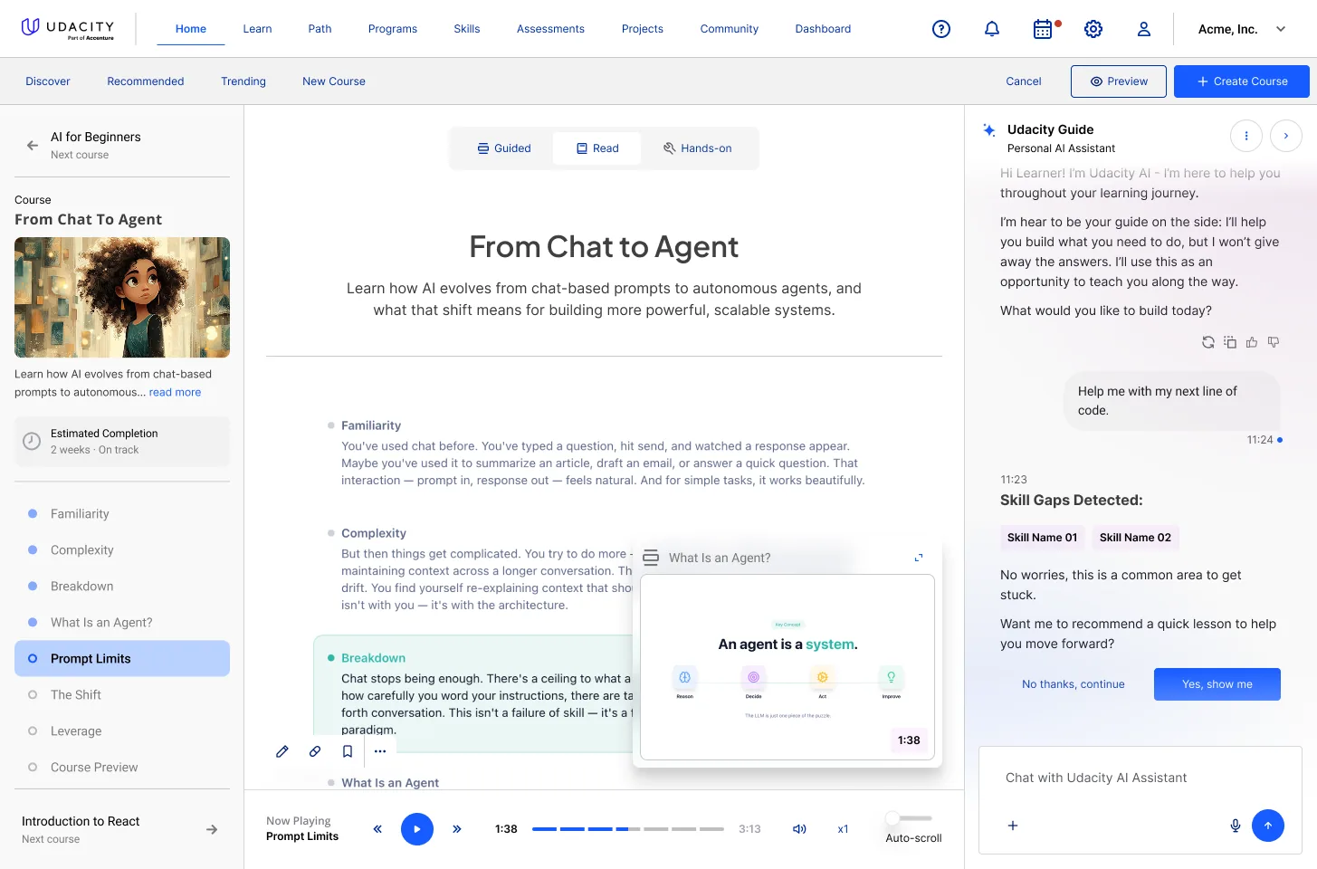
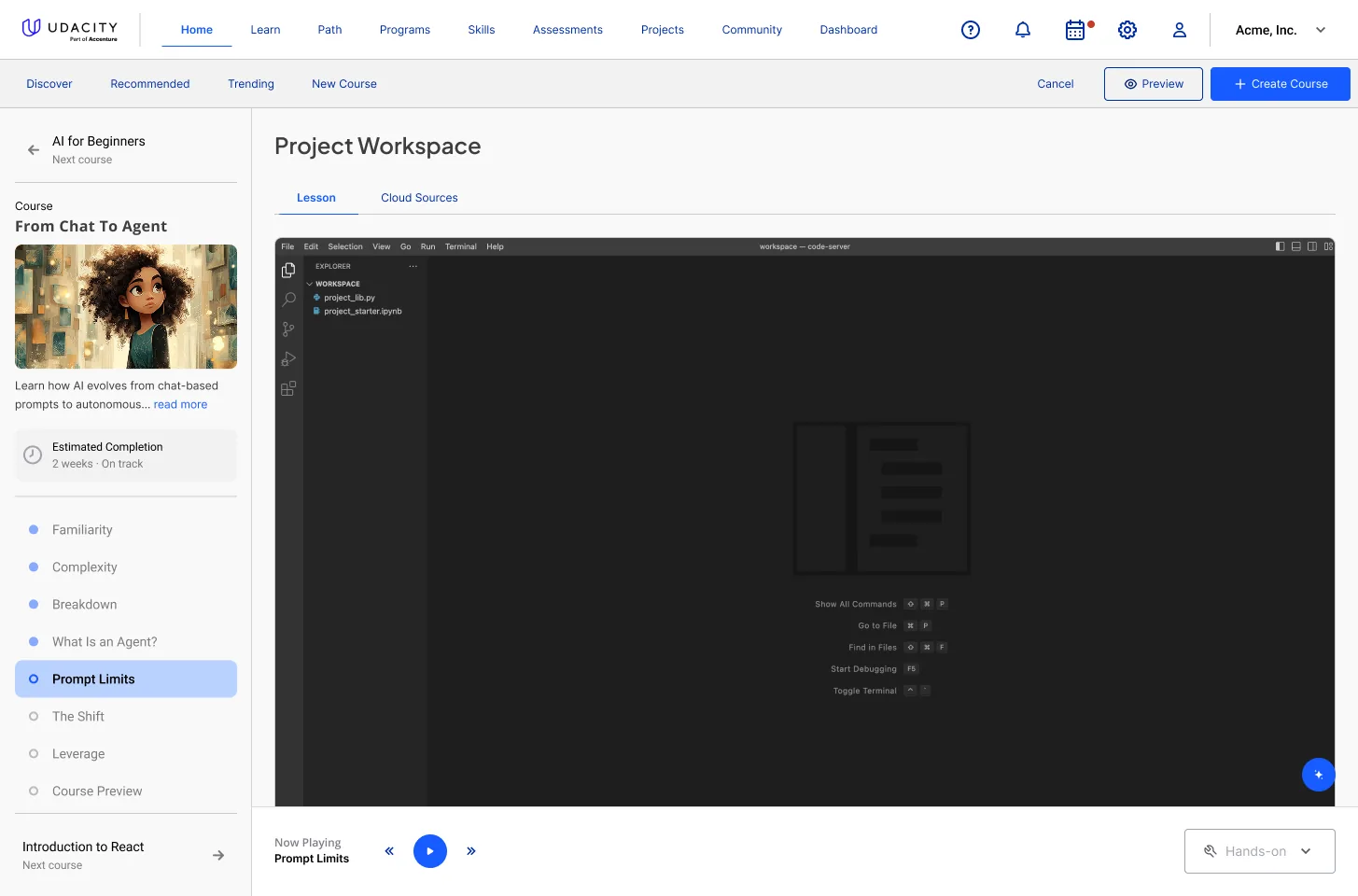
Detected skill gaps, and hands-on work inside the same frame.
The interruption is the part I was most careful with. When the assistant detects a gap it names it, explains that it is common, and offers a short lesson — then gives an explicit way out: No thanks, continue, sitting at equal weight beside Yes, show me. An assistant that interrupts a learner mid-lesson and does not offer a graceful decline is not helping, it is nagging, and it gets muted within a week. The permission to refuse is what keeps the feature usable in month two.
From Prompt to Project
The workspace is where a learner stops consuming and starts building. It opens on a single field — describe what you'd like to create — and turns that sentence into a real environment: VS Code or Jupyter in the browser, a starter project, and the assistant sitting alongside with the lesson context still loaded.
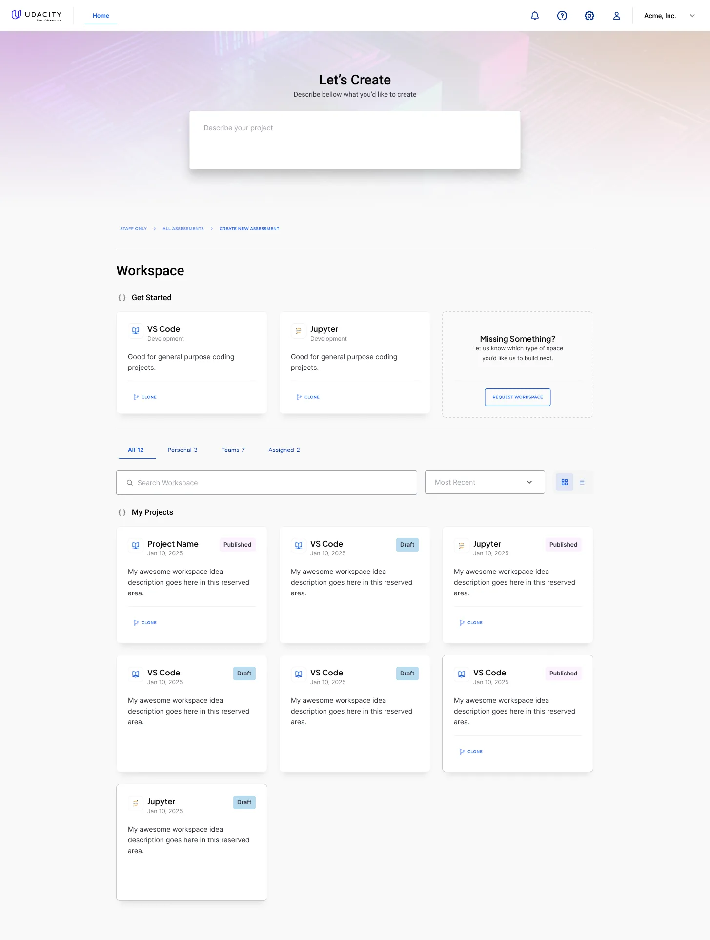
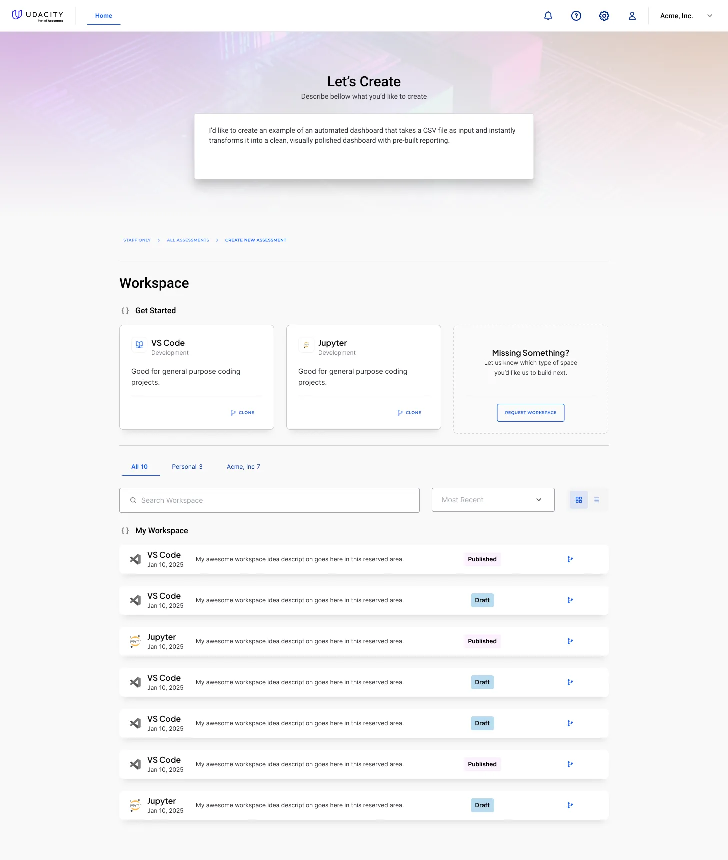
Entry, environment choice, and the learner's own project shelf.
The design problem here is that a full IDE is not a component you can style your way out of. My job was the frame around it: how a project is created, named, auto-saved, previewed, published and cloned; how personal work and organisation-assigned work stay distinguishable in one list; and how the assistant remains reachable without stealing width from the editor at the moment the learner needs it most.
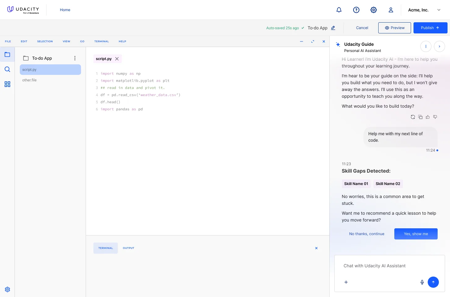
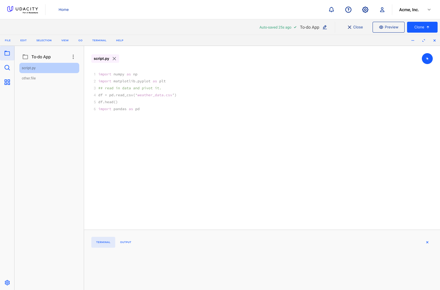
The editor with the guide alongside, and the publish state.
Publishing matters more than it appears. A finished project a learner can point at is the evidence they took the course for; the analytics surface later in this case study counts published projects and lines of code, not lessons completed, and that is deliberate — those are the numbers an employer would accept.
The Half Nobody Sees
None of the learner experience exists unless the content team can produce it, and internal tools are where a two-person design team earns its keep, because nobody else is going to design them. Studio is the authoring side: course scope, structure, objectives, cover, and the media that goes in.
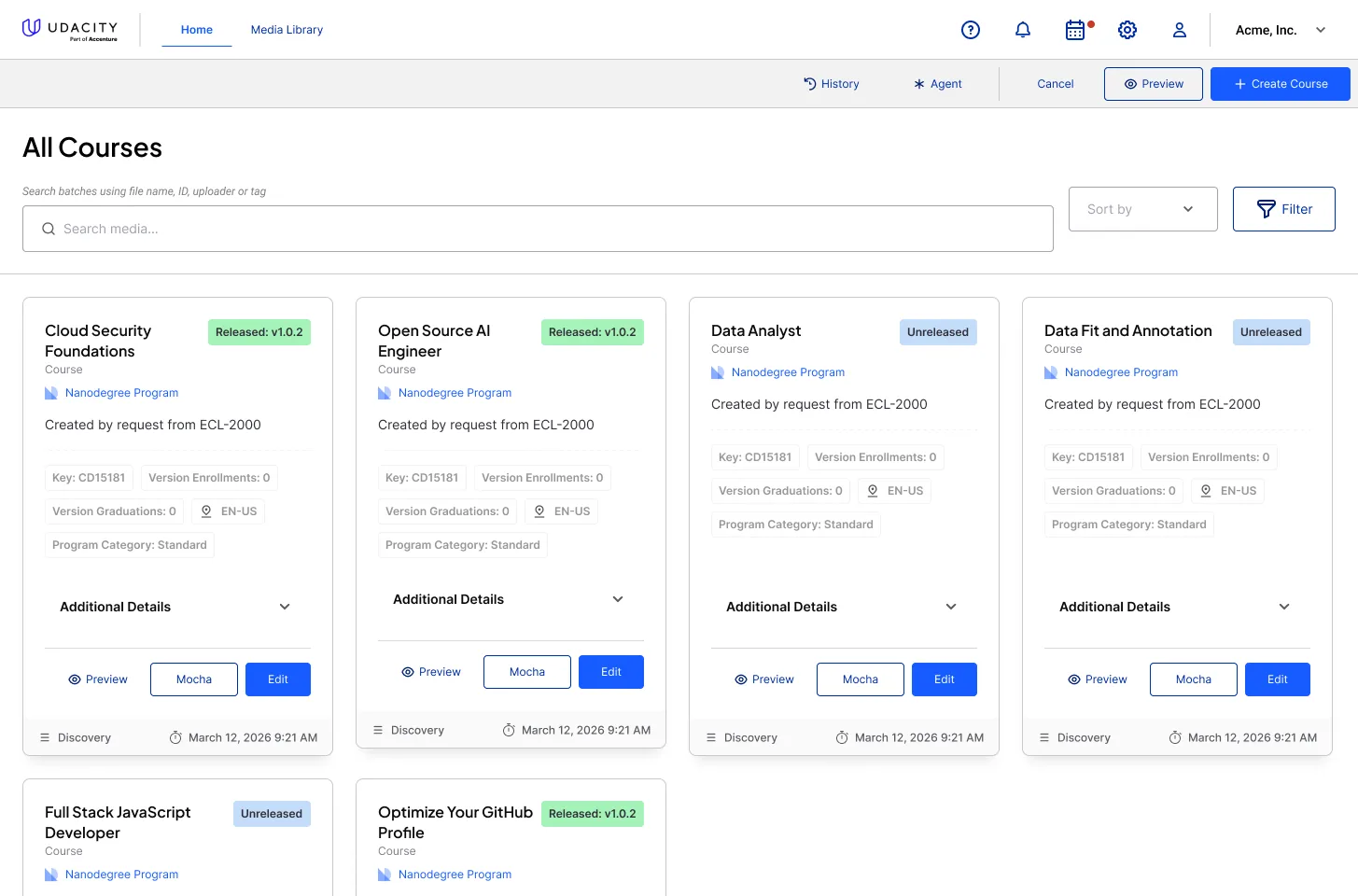
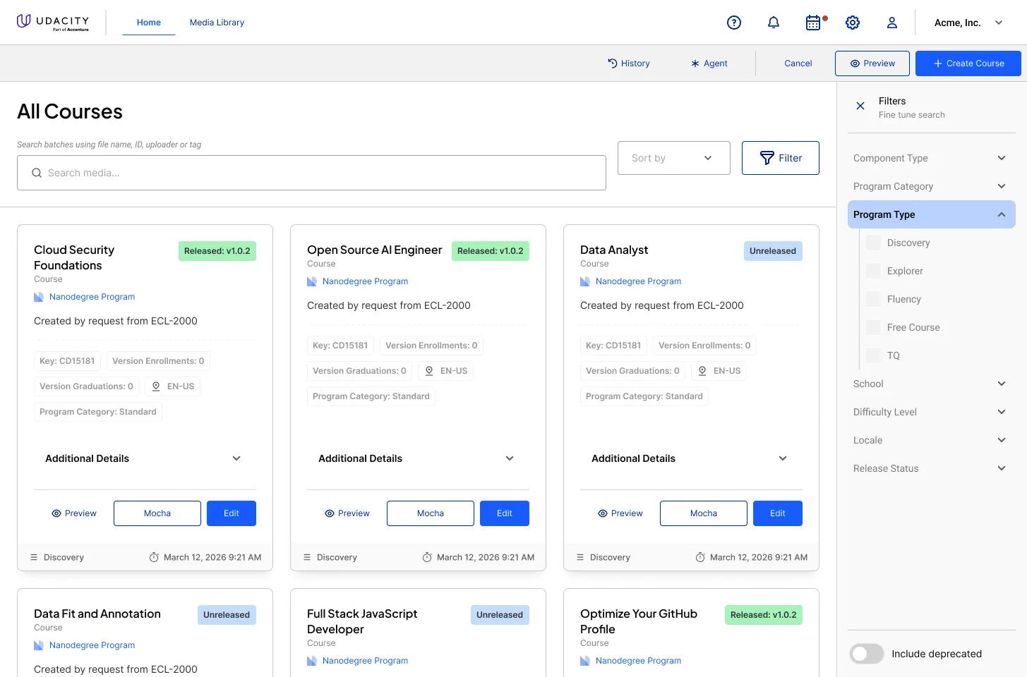
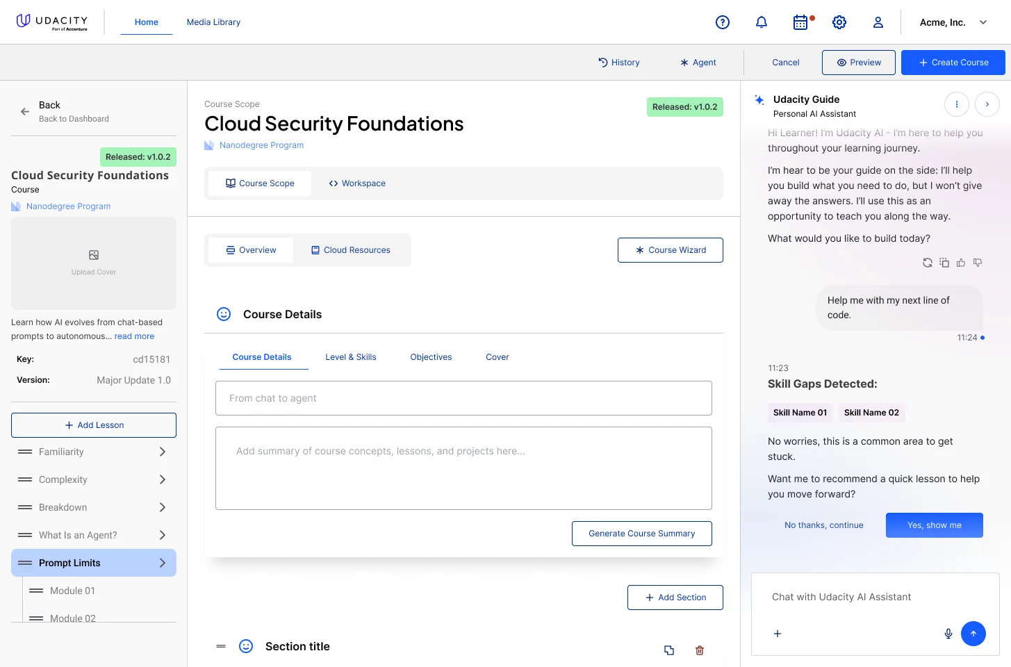
The course inventory, its filters, and the scope editor.
Two things drove the design. The first is versioning as a first-class state: a course is Released v1.0.2 or Unreleased, with enrolment and graduation counts attached, because an author editing a live course with active students is doing something categorically different from drafting a new one and the interface has to say so before they type. The second is the taxonomy — school, program category, difficulty, locale, component type — which is the same vocabulary the learner-facing discovery experience depends on. Getting it entered correctly here is what makes filtering work there.
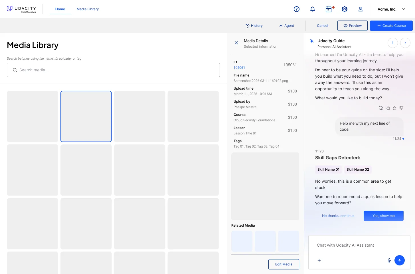
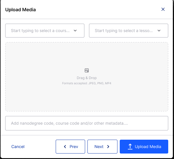
Media at rest, and metadata captured at the point of upload.
The media library is the same argument in miniature. Every asset carries its course, lesson, uploader, tags and related media, and the upload flow asks for that metadata before the file lands rather than promising to clean it up later. A library of ten thousand untagged screenshots is not a library.
Alongside Studio I designed the internal contract configuration UI for Workera assessments: an expandable section with an API-populated assessment table, title search, alphabetical sorting, and visual distinctions between assessment types and platforms — with tooltips explaining the difference between a legacy CAT assessment and a SAGE / Signature one, plus the loading, empty, error and accessibility states an internal tool usually goes without. Those screens are not shown here.
Designing Across a Migration
The skills half of the platform was mid-transition the entire time I worked on it: a legacy CAT assessment engine and the newer SAGE / Signature assessments running side by side, with Workera in the mix, and a real inventory containing both.
The tempting design is the one that assumes the migration is finished. It is also the one that breaks on contact with the actual catalogue. I designed for the mixed state as the permanent state: every surface that lists an assessment has to make the two generations distinguishable without requiring the reader to already know the difference, which is why the indicators are paired with plain-language tooltips rather than a legend somewhere else. A staff member configuring a contract should not need to have been at the company for the migration to make a correct choice.
This is unglamorous work and it is most of what shipping inside a real platform actually is. A design that only works after the cleanup is a design that never ships.
Reading It Back
The last stage of the loop is the one that tells an organisation whether any of it worked. The analytics surfaces report on skills acquired, assessments passed, projects published, lines of code written, and skills demonstrated in published work — over time, by source, and per learner.
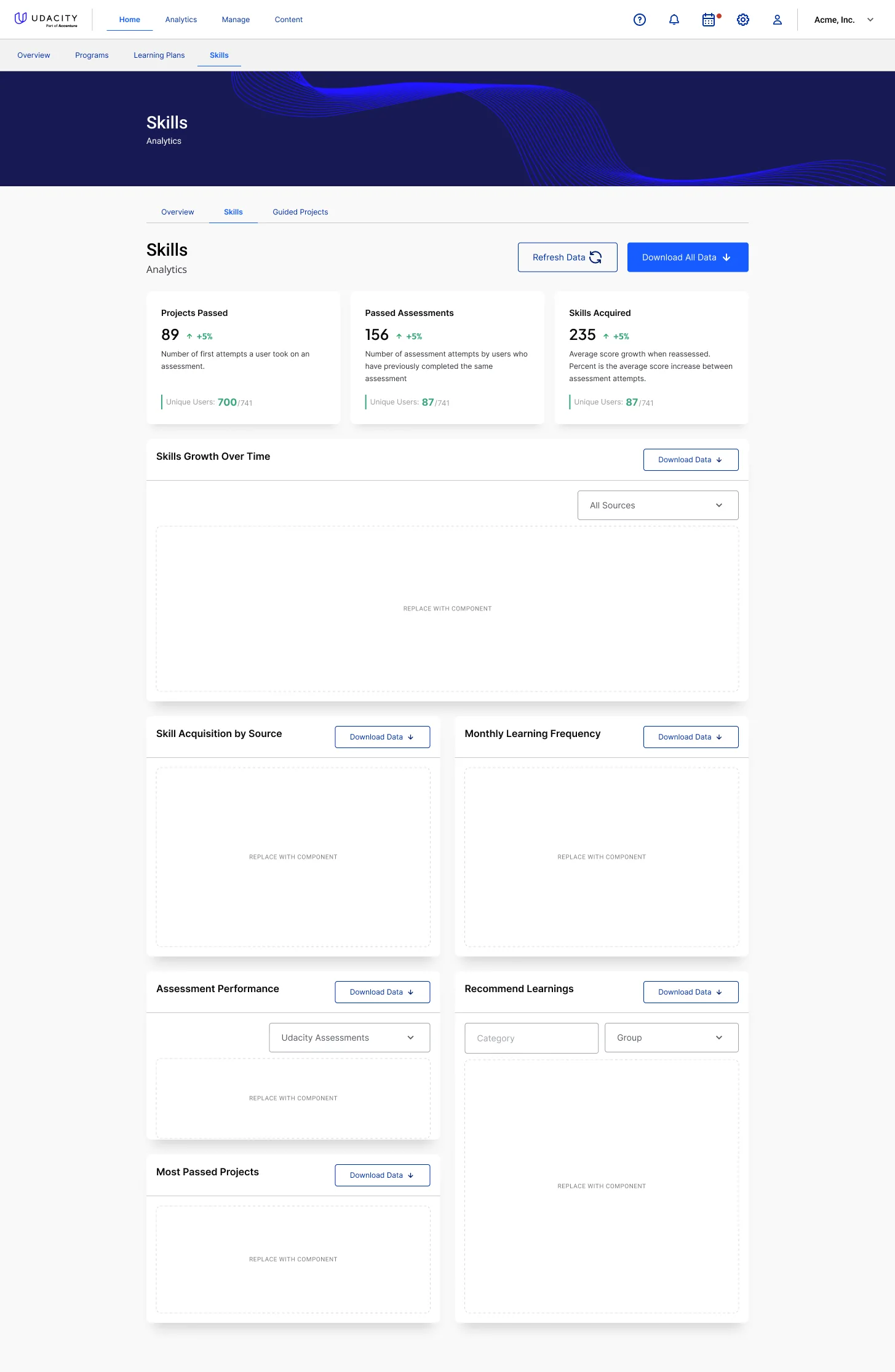
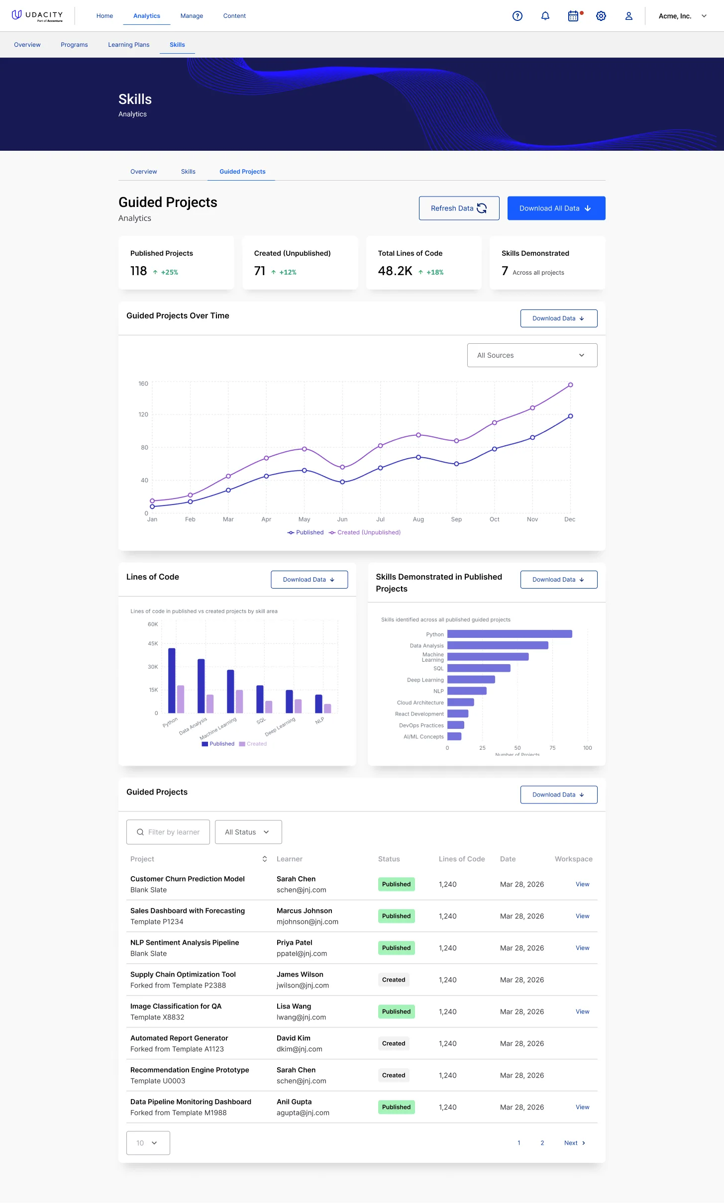
Skills and guided-projects analytics, with the underlying records reachable from the chart.
I designed these to answer the question an enterprise buyer actually asks, which is not "did people watch the videos". Every chart resolves to a table of specific records — this person, this project, this status, this date — because an aggregate nobody can drill into is a number people stop believing after the second quarter.
Design Challenges
- Two Designers, Many Squads: Design could not become the bottleneck, so the answer had to be leverage rather than throughput — shared patterns, a component language, and enough cross-team context to catch the inconsistencies no single feature team could see from inside their own surface.
- A Developer-First Organisation: The default path was a PRD arriving with the solution already chosen. Changing that meant showing, repeatedly, that the earlier conversation produced a better product — and picking which battles were worth the friction, because "we need a design system" is a sentence that costs political capital in some rooms.
- An Assistant That Is Not a Chatbot: The hard part of AI in a learning product is restraint. Deciding when it may interrupt, what it must refuse, how it declines to hand over an answer, and how a learner turns it down without losing anything — those decisions are the product; the chat window is not.
- Two Assessment Generations at Once: Designing for a mixed CAT and SAGE inventory rather than for the clean post-migration world that did not exist yet.
- Learner-Facing and Staff-Facing in One Model: The taxonomy an author types into Studio is the taxonomy a learner filters by. Designing both sides let me keep one vocabulary instead of two that drift.
- Distilling Technical Complexity: Skill graphs, assessment engines, cloud workspaces and versioned content are genuinely complicated. The whole job is turning that into a screen a person can act on in ten seconds.
How I Know What Held
I am not going to put invented numbers on in-house work I am still doing. What I can be specific about is what was decided, what those decisions cost, and what I chose to design for rather than assume away.
- Surfaces designed
- Onboarding, assistant, profile, classroom, workspace, authoring, analytics
- One learner model, not five
- Onboarding, the profile, the skills selection, assessment and recommendations all read and write the same record, which is what makes a goal stated on day one still legible in a lesson on day thirty.
- Personalisation stated, not implied
- Every field passed to the assistant is shown to the learner in plain language and is editable, including the tone it speaks in.
- Refusal designed in
- The assistant declines to give answers by persona, and every interruption carries an equal-weight decline.
- Built for the messy state
- Mixed CAT and SAGE inventory, unreleased and live course versions, empty and error states in tools that usually ship without them.
- Evidence over engagement
- The analytics count published projects, lines of code and demonstrated skills, and every chart drills to the individual records behind it.
What was never measured
The thing this whole layer is a bet on. There is no instrumentation answering whether an intent-based onboarding produces better retention than the catalogue did, whether learners who edit their memory profile trust the recommendations more, how often the assistant's skill-gap interruption is accepted versus declined, or whether the multi-mode lesson is used the way the preference setting predicts. I raised the gap: a student experience you can only judge qualitatively is one you improve by argument rather than by evidence, and in a two-designer team argument is the scarcer resource. Closing it is instrumentation work, and it is not done.
What I would do differently
I would have spent my first quarter fighting for measurement instead of for scope. Coming in across teams, the visible problem was that the surfaces did not add up, and I went at that directly — which was the right diagnosis and produced most of what is on this page. But it meant I built the case for each redesign the same way every time, from reasoning and craft, in a room full of engineers who are entirely persuadable by data and only sometimes by a rationale.
The single highest-leverage thing a small design team can install in a developer-first company is not a component library. It is the instrumentation that lets the next design argument be settled instead of debated, and I would install it before earning the right to redesign anything.
Conclusion
Impact: A year of work that could have been fifteen unrelated features and instead became one argument: that a learning platform should find out what someone is actually trying to do, tell them plainly what it has concluded, and act on it consistently from the first question to the published project. Onboarding, an AI guide with a readable memory, a multi-mode classroom, a cloud workspace, the authoring tools behind all of it, and the analytics that report on it — designed by one of two designers, across squads, in an organisation where design had to argue its way upstream of the ticket. It is the clearest example of how I work inside a real platform: on the whole loop, including the internal half nobody screenshots.